Intro
As I got back from PASS I realized I have never actually tried geo features in Power BI. Therefore I decided to give it a try and create PB report which would show some interesting statistics regarding the Czech Republic. I selected visualizing Criminality in the Czech Republic across regions as the topic. My intention was to have a nice visual for the comparison of:
- How dangerous each reason is (filtering based on type of crime)
- How successful the police are in clearing-up of crimes.
I would like to now summarize lessons gained during this exercise.
Implementation
First I needed to get some data. As I searched across the internet I found a valuable dataset at the Police of Czech Republic website. The problem with this dataset is its structure, therefore I have manually created two lists for data extension: List of Areas (mapping Area Code to Real name) and List of Crime Groups so we could better filter on top of the Crime list. Then loading of the data into Power BI Desktop and Tailoring a couple of measures such as % of explained crimes was a piece of cake. The fun started when I tried to visualize the data. My target was to show the difference of successfully solved crimes by Police among the regions.
Try #1 – Bing maps – A nice tool which is good for visualization of places (not really regions). Visualization form is one point where you can influence the size and color via data from your dataset. Well, the result was not appealing. I recognized problems with identifying regions in the Czech Republic and I got better results when I added some central city of the region as a location identifier. (The problem of course is if you have inner regions in some other region as we have with Prague and the Central Bohemia region.)

Figure 1- Visualization via Bing Map
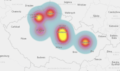
Try #2 – New ArcGis maps – Same problems as Bing Maps with regions. Visualization is nicer and you have more options here (heat map is an appealing one).

Figure 2 – Visualization via ArcGis
But in the end, the predicative ability of this visual is not really valuable for my case.
Try #3 – New Shape map using TopoJson. This looks like what I wanted but it has some obstacles because there is no out of the box support for countries other than the US. Therefore there are a few tasks you need to solve:
-
Find shape of map you need (search for shapefile)
- I found a source of free GIS data here (even for Czech Republic 🙂 ) http://www.diva-gis.org
-
Transform the map into TopoJson
- Great online service you can use for shape files visualization and transformation http://mapshaper.org/
-
Map data into TopoJson keys
- Manual work with your data and TopoJson file but acceptable as we only have 14 regions.
-
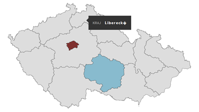
Warning: Power BI Desktop supports national characters when mapping data to regions but not really Power BI service as you can see in the following figure.

Figure 3- Power BI Online was not able to map region with national characters
I as well found the Attribute Slicer visual very useful for additional filtering options for Type of Crime values. So this is my final dashboard:
Summary
Playing with maps was a very nice exercise and of course it matters what component is most feasible for your use case. Basically anyone can now create some fancy report based on geo data in Power BI. There is still a focus on US customer base in all maps but this is kind of understandable.

